Revamping Osheaga’s website with CSS Grids
Author
Plank
Date
mai 1, 2018

CSS Grid Layout is the most groundbreaking thing that has happened to CSS specs — in the past 2 years at least. I won’t do the whole genesis of how it came to be, others have done it already. Instead, let me tell you how the websites of Montreal’s high profile music festivals were the perfect use case for it.
The challenge
First, a little backstory. Last year, we developed a platform for our client evenko — producer and promoter of these festivals — that endowed them with greater content management capabilities along with implementing a clean and consistent UI on the front-end across all websites.
A greater level of control for the administrative users comes with the necessity that every UI container be highly modular. One of the things that kept us on our toes about that aspect is how these blocks were going to systematically arrange themselves. To put it simply, one feature — which we refer to as module — can be displayed in a container which in turn could have various widths. Here’s a sketch of the different containers we find on the websites:
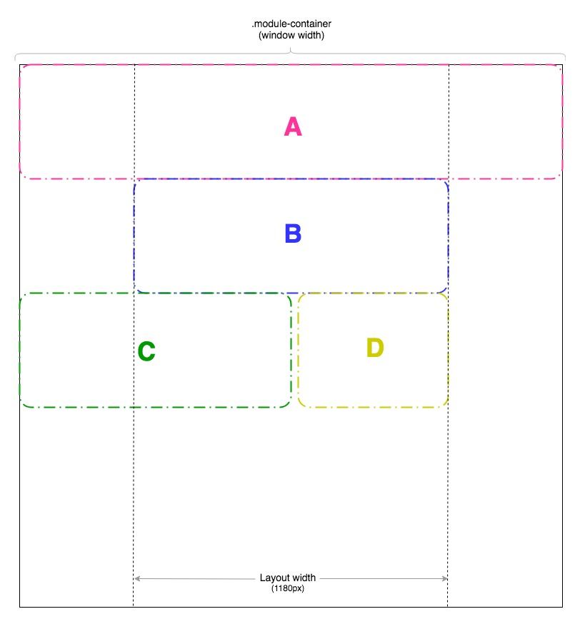
- ContainerA:
Spans the full width - Container B:
Spans the full width inside the layout wrapper - Container C:
Spans half the window width - Container D: Spans half the layout width
These blocks all stack up inside this one parent div (.module-container) and the order is entirely to admin’s discretion. With that in mind, some Flexbox fiddling had to be done to take into account every possible order — especially the half-widthblocks. For instance, combinations like:
- C – C
- D – D
- C – D
- D – C
- D – C – D
- C – C – C
- and so on…
are all problematic at first. In a normal set up, 2 half-width blocks sharing the same row is business as usual: just wrap ’em in a flex parent. But this is not possible here, remember? Admin has full control of what’s being thrown in the module container and we therefore cannot assume they’re going to group them 2 by 2 or have an even amount of half-width blocks.
CSS Grids to the rescue
This past winter, with the websites theme overhaul phase and with a now strong cross-browser support for CSS Grid Layout Module, it was time to let go of the way it was done last year — which was based on Flexbox and required lots of CSS classes and exceptions to cover ALMOST all scenarios.
The solution
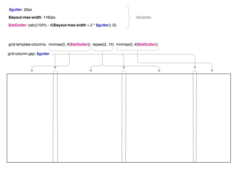
#sass

$gutter: 20px

$layout-max-width: 1180px

$latGutter: calc((100% - #{$layout-max-width + 2 * $gutter}) / 2)

.module-container

    display: grid

    grid-template-columns: minmax(0, #{$latGutter}) repeat(2, 1fr) minmax(0, #{$latGutter})

    grid-column-gap: $gutter
There’s actually a bit more that goes with it, but it is essentially the backbone of the entire grid system. This bit of code deserves some explanation, so let’s break it down by superimposing it on top of our mocked layout (sorry in advance for all the arrows).
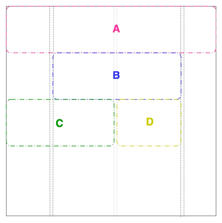
When creating a new modules, the admin user is given 2 parameters to select from to set its size:
Module size:
- Full width (default)
- Half width
Constrain module (is the above size relative to wrapper or window):
- Yes
- No (default)
The value of the parameters yields a specific CSS class.
#sass

.module-span-full

    grid-column: 1/-1

    &.module-constrain

        grid-column: 2/-2

.module-span-half

    grid-column-start: 1

    grid-column-end: span 2

    + &

        grid-column-start: -3

    &.module-constrain

        grid-column-end: span 1
Now for example, creating modules with size A, B, C, and D respectively, blocks will naturally stack up inside the module container as follows:
That’s the gist of it. Go see it live in action on Osheaga, IleSoniq, Heavy Montreal websites.
